
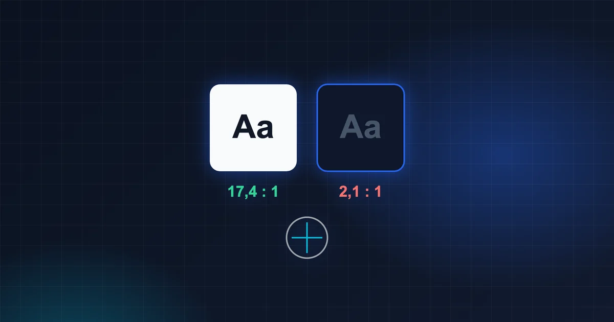
In short: A contrast calculator is only accurate if you feed it the colours a person actually sees. Transparency, overlapping layers, dark mode or overridden styles change them. That's why you should measure contrast directly in the rendered page — for normal text, aim for at least 4.5:1.
It has happened to me more than once: in the design I had colours that, according to the contrast calculator, met every requirement. On screen, the text was still hard to read. The mistake wasn't in the calculator — it was in what I had fed into it.
Why the palette lies
When you check contrast in a palette or in a design tool, you are comparing two colours as you wrote them. But on screen, a person sees something else:
1. Transparency. Text with rgba(0, 0, 0, 0.6) doesn't have a single colour. Its actual colour depends on what it sits on. On white it is different from on a light blue panel.
2. The background isn't the one you think. A card has a background, beneath it a panel, beneath that the page, and somewhere a gradient or an image. The calculator compares the text with white, but in reality the text sits on a semi-transparent panel over grey.
3. CSS overrides CSS. A global style, a library theme, dark mode — the colour you set in the component may not be the one that won. A single rule with higher priority is enough.
4. Libraries calculate “colour on colour” in their own way. Some UI libraries automatically choose the text colour on a coloured button. Not always correctly — especially with medium-light colours.
5. Dark mode. A colour that works on white can be unreadable on a dark background. And dark mode is often added last.
How to measure what a person actually sees
Quick: DevTools
In Chrome, right-click the text → Inspect. In the Styles panel, click the colour swatch. Chrome shows the contrast ratio and whether it meets AA and AAA. It uses the element's actual background, if it can determine it.
With transparent and layered backgrounds, don't rely on it blindly — that's when the next step helps.
Thorough: measure the pixels
The most reliable way is to take a screenshot and measure the colour of the text and the colour of the background directly from the pixels (with the eyedropper in any image editor). That is exactly what a person sees.
Automated: a script in the browser
If you have many screens, it's worth having a script that goes through the texts in the browser, finds their computed colour (getComputedStyle), composites the transparency with the background beneath them and calculates the contrast. The skeleton of the calculation:
function jas([r, g, b]) {
  const k = c => {
    c /= 255
    return c <= 0.03928 ? c / 12.92 : ((c + 0.055) / 1.055) ** 2.4
  }
  return 0.2126 * k(r) + 0.7152 * k(g) + 0.0722 * k(b)
}

function kontrast(farbaA, farbaB) {
  const [svetlejsia, tmavsia] = [jas(farbaA), jas(farbaB)].sort((a, b) => b - a)
  return (svetlejsia + 0.05) / (tmavsia + 0.05)
}

kontrast([102, 102, 102], [255, 255, 255]) // ≈ 5.7 → normal text OK
The formula comes from the WCAG standard. The harder part isn't the calculation, but finding the actual background: walking up the element's parents and compositing their transparent backgrounds.
Which values to aim for
- Normal text: at least 4.5:1 (WCAG AA).
- Large text (roughly 24 px, or 18.5 px bold): at least 3:1.
- Icons and borders of important elements: at least 3:1.
In practice I leave myself a margin. For people who wear glasses or work on a laptop by a window, 4.5:1 is the minimum, not the goal.
Font size matters just as much
Contrast won't help if the text is 10 px. In admin panels, where people sit all day, I keep text at a minimum of around 12 px, and labels preferably at 13 px with a bolder weight. Small grey type looks elegant in a presentation. On Monday morning in the office, not so much.
Practice exercise
Open your application in both light and dark mode and pick the five texts people read most often: the menu, field labels, status labels, grey helper texts, text on coloured buttons.
For each of them:
- measure the contrast in DevTools,
- take a screenshot and measure the colour of the text and the background with the eyedropper,
- compare both results.
With grey helper texts and labels on a coloured background, the numbers often diverge. That's exactly where the work is.
Frequently asked questions
Is it enough to lighten or darken the colours?
Often, yes. With coloured labels, a solid background colour with white or dark text also helps, instead of a subtle tint with coloured text.
Does this apply to icons too?
If an icon carries information (for example a status), it should have a contrast of at least 3:1 against its surroundings. Decorative icons don't have to.
What about dark mode — is it enough to invert the colours?
No. Dark mode needs its own palette. Saturated colours that look good on white are often too dark on a dark background or, on the contrary, they scream.
In conclusion
The palette is the plan. The screen is reality. Measure contrast where people read it — in the browser, in both light and dark mode, on real content. You'll see how many “compliant” colours actually fall short.
Source: W3C, WCAG 2.1 – Understanding Success Criterion 1.4.3 Contrast (Minimum), w3.org/WAI/WCAG21/Understanding/contrast-minimum.